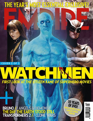
- Starting with the main selling point of the magazine which is of the 3 main characters in the frame. This is the main selling point because it gives away the genre, the man on the right is dressed in a superhero costume which tells the audience that there will be some action in the film. The man in the centre of the frame is blue and looks like there might be some element of sci-fi in the film.
- The title of the film is indicated very clearly in a yellow font colour. The title is in the second biggest font size on the page after the name of the magazine. The font colour is a yellow colour, the yellow may indicate light, linking this with the title of the film watchmen may tell the audience what the film may be about which may be a lighthouse.
- The magazine offers the first look at the citizen kane of superhero movies, people would want to read about this and find out how the film was constructed and if there will be any future films.
What i have picked up from this poster is how we could use props such as costumes to give away the genre.
No comments:
Post a Comment