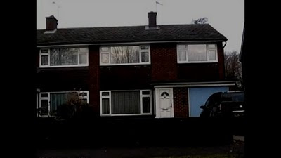
This is a typical establishing shot, this tells the audience the main location the film will be set in. As you can see its a normal nuclear family house which audiences can relate to.
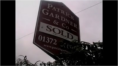 This is a close up of a sold sign, this tells the audience that the house shown previously has just been sold.
  This is a low angle shot of the male partner. The male partner is talking to the female partner about the new house they have moved in being alright.
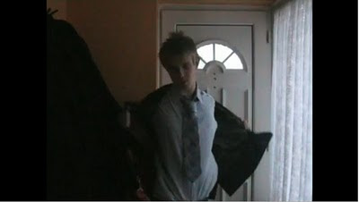 This is a mid shot of the male partner coming home from his job. The clothes he is wearing is a suit and the colour of his shirt is white which symbolises the good side. People can relate to the male partner as he is a normal man just trying to live a normal life.
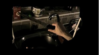 This is a close up a the killer holding a knife inside the couples house. The knife is the first genre indicator and tells the audience the genre is a horror/thriller.
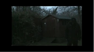 This is a mid shot of the killer. The dark clothes he/she is wearing symbolise evil and tell the audience he is the bad person in the trailer.
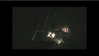
This is a mid shot of a swing swinging on its own. This is a typical horror trailer shot, it makes the audience feel uncomfortable about how the swing is swinging on its own.
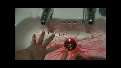 This is a close up of someone washing blood of their hands. This shot in my opinion is very effective as it leaves an enigma about who's hands they are and who's blood that is.
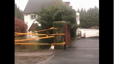 This is a long shot of a house surrounded in a yellow caution tape. The tape indicates a crime scene where people should not enter. This leaves a massive enigma for the audience of who's house it is and why its taped off.
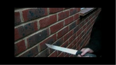 This is an extreme close up of the killer scraping a knife against the wall. The killer is indicated by the black clothing he/she is wearing. This is a typical horror shot of the killer playing around with his/hers weapon, it also creates an uncomfortable sound for the audience.
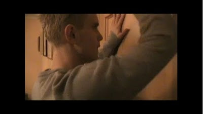 This is a close up of the male partner trying to open a locked door. This is effective because the man is locked out of a room in his own house. It also leaves an enigma about who has locked it.
 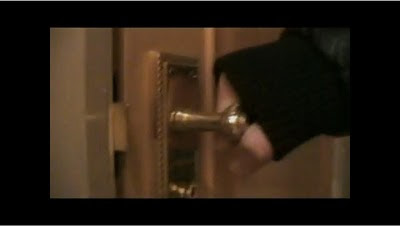 This is an extreme close up following the previous shot. It solves the mystery of who locked the door as someone with black clothing is holding the door, the black clothing tells the audience that its the killer holding the door.
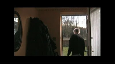 This is mid shot of the male partner looking around outside after someone knocked on his door and played a prank on him. He typically blames it on teenagers but it leaves an enigma of who it actually was.
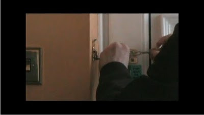 This is an extreme close up of the male partner locking the door. This is purposely done to tell the audience that the male partner doesn't want anyone entering the house.
 This is a two shot of the killer and the helpless male partner. This is a typical horror shot of the killer coming up behind the male partner. I think this is also a very effective shot, because the male partner is sitting down and the killer is standing up, it tells the audience who the superior and inferior characters are in the film. This shot also follows a story from the previous shot and leaves a massive enigma about how the killer got in the house after the male partner locked it.
 This is the second to last shot of the trailer. This tells the audience the title of the film, the release date, the production companies involved in the film, the cast and producers and directors. This tells the audience some crucial information that they need to know and makes it look more professional.
In my opinion i think this is a very effective trailer as it follows all horror trailer conventions and leaves lots of enigmas for the audience, the more mysteries in the film the more it will keep audiences interested and therefore will attract them to watch the actual film to find out what really happens.
No comments:
Post a Comment