Wednesday, 31 March 2010
Upload of analysis of our films - Evaluation
This is video one which shows other people in our classes analysis.
This is our section of our analysis it runs from 0.00 - 3.34
Evaluation of our trailer
titles: Titles are used to create and sustain tension within our trailer. They are used in our trailer to help portray the narrative as well as being an integral part of our trailer's makeup.
Pros - We used the titles effectively by having them run parallel to the narrative to lend hints to the story and intrigue the viewer. They also created suspense because we used plain white writing to signify purity and safety but all punctuation was in red signifying danger and violence, so that juxtaposition helped to build enigma into our trailer.
Cons - We only used a few titles in our trailer so using more would of improved our trailer by building on the suspense of our other titles.
sound: Sound is used effectively in our trailer. Mainly with the music we used which builds tension and hightens fear within the trailer. We also made some shots louder than others to make them stand out and to emphasise the shot significance.
Pros - Sound is used very well in our trailer to scare and surprise the audience. The music we used helped build tension and carry our trailer throughout the duration. We used editing effects to make some shots louder to emphasise certain shots which also hightened the audiences reaction to the trailer.
Cons - The music could have been edited together more smoothly to allow the trailer to flow better.
light: Light was used in our trailer to create fear in the unknown. We use as little light as possible to help build fear throughout the trailer and it gives the trailer an eerie feel.
Pros - Lighting was used to create atmosphere within our trailer and it did it effectively. We used low levels of light to create an eerie atmosphere which lent itself well to the narrative.
Cons - In some shots there is too little light to be able to distingiush what is going on in the scene, so some shots required more light to be effective.
props: Props were used to create realism within our trailer. We used typical horror props to create the generic horror feel within our trailer, this helped to create the realism which makes it scary.
Pros - We tried to create realism with our props and i think we suceeded by using real knives in our trailer, they made the trailer feel more authentic.
Cons - We didn't use a vast array of props which may have improved the look of our trailer.
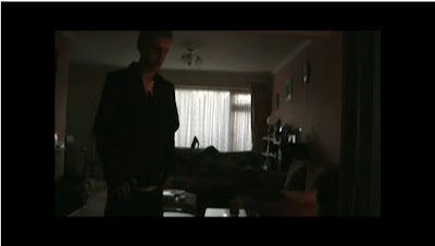
location: Location was a major part of our trailer. We only used one location so we had to create the right atmosphere within this location. The location we used was a house, this was important to create realism and allow the audience to relate to the trailer making it more scary and effective.
Pros - We used this location so that the audience could relate with our trailer and this location helped to do this.
Cons - We only used one location in our trailer so this could have been built on to give the trailer a sense of scale by introducing more locations and settings.
editing: Editing was the most important part of our trailer. We used editing to create tension and allow the trailer to flow. We used a montage in our trailer and this was painstakingly edited together to allow it to flow freely and have the desired effect.
Pros - We created a montage in our trailer to allow many shots to be shown in a short amount of time and i think this worked well to explain simply the narrative and show some action that will appeal to our target audience.
Cons - The transitions could have been more smooth to allow the trailer to flow better, this would have made the trailer feel more professional.
costumes: We thought about costume carefully because it played a vital part in the believeability of our trailer. The costumes we used were generic to allow for the audience to relate to the trailer and believe it.
Pros - We used our costumes to indicate to the audience who each character was, for instance the evil character from our trailer was wearing black to symbolise danger and him being a dark character. I think we used costume well to allow the audience to understand and go along with the narrative. We also dressed our main characters in normal clothes to allow the audience to relate with our characters to make the trailer more effective.
Cons - Our evil character could have had a better costume to fit his role, we only used a black hoodie for the character whereas he would have looked more scary if he had a purpose made costume.
Pros - We used the titles effectively by having them run parallel to the narrative to lend hints to the story and intrigue the viewer. They also created suspense because we used plain white writing to signify purity and safety but all punctuation was in red signifying danger and violence, so that juxtaposition helped to build enigma into our trailer.
Cons - We only used a few titles in our trailer so using more would of improved our trailer by building on the suspense of our other titles.
sound: Sound is used effectively in our trailer. Mainly with the music we used which builds tension and hightens fear within the trailer. We also made some shots louder than others to make them stand out and to emphasise the shot significance.
Pros - Sound is used very well in our trailer to scare and surprise the audience. The music we used helped build tension and carry our trailer throughout the duration. We used editing effects to make some shots louder to emphasise certain shots which also hightened the audiences reaction to the trailer.
Cons - The music could have been edited together more smoothly to allow the trailer to flow better.
light: Light was used in our trailer to create fear in the unknown. We use as little light as possible to help build fear throughout the trailer and it gives the trailer an eerie feel.
Pros - Lighting was used to create atmosphere within our trailer and it did it effectively. We used low levels of light to create an eerie atmosphere which lent itself well to the narrative.
Cons - In some shots there is too little light to be able to distingiush what is going on in the scene, so some shots required more light to be effective.
props: Props were used to create realism within our trailer. We used typical horror props to create the generic horror feel within our trailer, this helped to create the realism which makes it scary.
Pros - We tried to create realism with our props and i think we suceeded by using real knives in our trailer, they made the trailer feel more authentic.
Cons - We didn't use a vast array of props which may have improved the look of our trailer.
location: Location was a major part of our trailer. We only used one location so we had to create the right atmosphere within this location. The location we used was a house, this was important to create realism and allow the audience to relate to the trailer making it more scary and effective.
Pros - We used this location so that the audience could relate with our trailer and this location helped to do this.
Cons - We only used one location in our trailer so this could have been built on to give the trailer a sense of scale by introducing more locations and settings.
editing: Editing was the most important part of our trailer. We used editing to create tension and allow the trailer to flow. We used a montage in our trailer and this was painstakingly edited together to allow it to flow freely and have the desired effect.
Pros - We created a montage in our trailer to allow many shots to be shown in a short amount of time and i think this worked well to explain simply the narrative and show some action that will appeal to our target audience.
Cons - The transitions could have been more smooth to allow the trailer to flow better, this would have made the trailer feel more professional.
costumes: We thought about costume carefully because it played a vital part in the believeability of our trailer. The costumes we used were generic to allow for the audience to relate to the trailer and believe it.
Pros - We used our costumes to indicate to the audience who each character was, for instance the evil character from our trailer was wearing black to symbolise danger and him being a dark character. I think we used costume well to allow the audience to understand and go along with the narrative. We also dressed our main characters in normal clothes to allow the audience to relate with our characters to make the trailer more effective.
Cons - Our evil character could have had a better costume to fit his role, we only used a black hoodie for the character whereas he would have looked more scary if he had a purpose made costume.
Tuesday, 30 March 2010
Analysis of every shot in the trailer : Evaluation
I am going to evaluate the most important shots in our trailer to explain and make people understand the meaning of every shot.
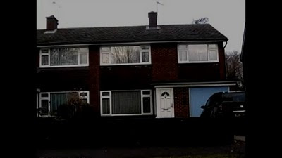
This is a typical establishing shot, this tells the audience the main location the film will be set in. As you can see its a normal nuclear family house which audiences can relate to.
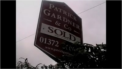 This is a close up of a sold sign, this tells the audience that the house shown previously has just been sold.
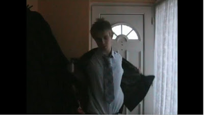
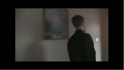
 This is a mid shot of the male partner coming home from his job. The clothes he is wearing is a suit and the colour of his shirt is white which symbolises the good side. People can relate to the male partner as he is a normal man just trying to live a normal life.
 This is a close up a the killer holding a knife inside the couples house. The knife is the first genre indicator and tells the audience the genre is a horror/thriller.
 This is a mid shot of the killer. The dark clothes he/she is wearing symbolise evil and tell the audience he is the bad person in the trailer.
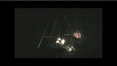
This is a mid shot of a swing swinging on its own. This is a typical horror trailer shot, it makes the audience feel uncomfortable about how the swing is swinging on its own.
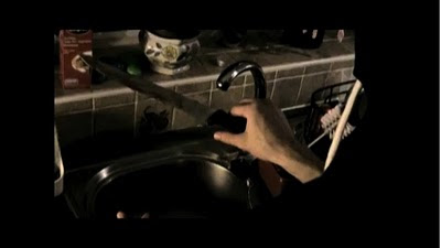
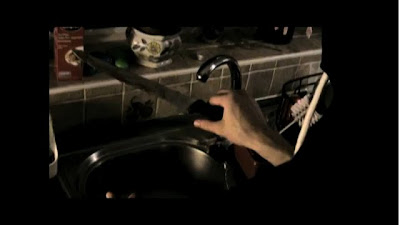
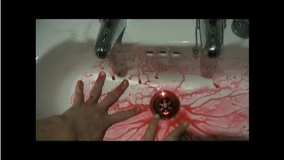 This is a close up of someone washing blood of their hands. This shot in my opinion is very effective as it leaves an enigma about who's hands they are and who's blood that is.
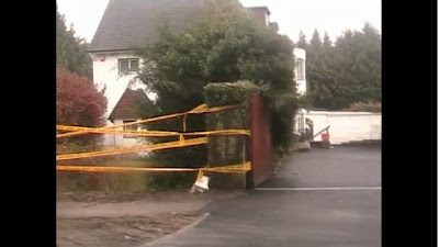
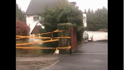 This is a long shot of a house surrounded in a yellow caution tape. The tape indicates a crime scene where people should not enter. This leaves a massive enigma for the audience of who's house it is and why its taped off.
 This is an extreme close up of the killer scraping a knife against the wall. The killer is indicated by the black clothing he/she is wearing. This is a typical horror shot of the killer playing around with his/hers weapon, it also creates an uncomfortable sound for the audience.
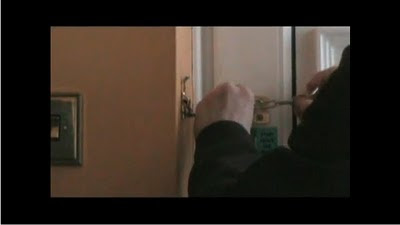
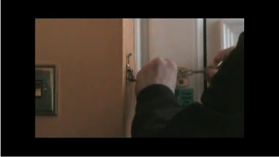
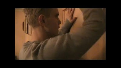 This is a close up of the male partner trying to open a locked door. This is effective because the man is locked out of a room in his own house. It also leaves an enigma about who has locked it.
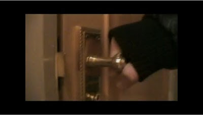 This is an extreme close up following the previous shot. It solves the mystery of who locked the door as someone with black clothing is holding the door, the black clothing tells the audience that its the killer holding the door.
 This is mid shot of the male partner looking around outside after someone knocked on his door and played a prank on him. He typically blames it on teenagers but it leaves an enigma of who it actually was.
 This is an extreme close up of the male partner locking the door. This is purposely done to tell the audience that the male partner doesn't want anyone entering the house.
In my opinion i think this is a very effective trailer as it follows all horror trailer conventions and leaves lots of enigmas for the audience, the more mysteries in the film the more it will keep audiences interested and therefore will attract them to watch the actual film to find out what really happens.
This is a typical establishing shot, this tells the audience the main location the film will be set in. As you can see its a normal nuclear family house which audiences can relate to.
This is a close up of a sold sign, this tells the audience that the house shown previously has just been sold.  This is a low angle shot of the male partner. The male partner is talking to the female partner about the new house they have moved in being alright.
This is a mid shot of the male partner coming home from his job. The clothes he is wearing is a suit and the colour of his shirt is white which symbolises the good side. People can relate to the male partner as he is a normal man just trying to live a normal life. This is a close up a the killer holding a knife inside the couples house. The knife is the first genre indicator and tells the audience the genre is a horror/thriller. This is a mid shot of the killer. The dark clothes he/she is wearing symbolise evil and tell the audience he is the bad person in the trailer. This is a mid shot of a swing swinging on its own. This is a typical horror trailer shot, it makes the audience feel uncomfortable about how the swing is swinging on its own.
This is a close up of someone washing blood of their hands. This shot in my opinion is very effective as it leaves an enigma about who's hands they are and who's blood that is. This is a long shot of a house surrounded in a yellow caution tape. The tape indicates a crime scene where people should not enter. This leaves a massive enigma for the audience of who's house it is and why its taped off. This is an extreme close up of the killer scraping a knife against the wall. The killer is indicated by the black clothing he/she is wearing. This is a typical horror shot of the killer playing around with his/hers weapon, it also creates an uncomfortable sound for the audience. This is a close up of the male partner trying to open a locked door. This is effective because the man is locked out of a room in his own house. It also leaves an enigma about who has locked it. This is an extreme close up following the previous shot. It solves the mystery of who locked the door as someone with black clothing is holding the door, the black clothing tells the audience that its the killer holding the door. This is mid shot of the male partner looking around outside after someone knocked on his door and played a prank on him. He typically blames it on teenagers but it leaves an enigma of who it actually was. This is an extreme close up of the male partner locking the door. This is purposely done to tell the audience that the male partner doesn't want anyone entering the house. This is a two shot of the killer and the helpless male partner. This is a typical horror shot of the killer coming up behind the male partner. I think this is also a very effective shot, because the male partner is sitting down and the killer is standing up, it tells the audience who the superior and inferior characters are in the film. This shot also follows a story from the previous shot and leaves a massive enigma about how the killer got in the house after the male partner locked it.
 This is the second to last shot of the trailer. This tells the audience the title of the film, the release date, the production companies involved in the film, the cast and producers and directors. This tells the audience some crucial information that they need to know and makes it look more professional.
In my opinion i think this is a very effective trailer as it follows all horror trailer conventions and leaves lots of enigmas for the audience, the more mysteries in the film the more it will keep audiences interested and therefore will attract them to watch the actual film to find out what really happens.
Evaluation of our Editing : Evaluation
Every film is edited before release and the way they are edited create atmosphere for the audience. We have made a horror trailer and the atmosphere we needed to create was tense/creepy.
Pro's
Pro's
- The way we used fade to black during the montage linked the quick short shots together very well. We also varied the length of the shots through out the trailer, to create a certain atmosphere at a certain time, like during the montage we used quick short shots to create a tense atmosphere.
- The titles we used told the audience everything they needed to know, from the basic storyline of the film to what might happen in the film.
Cons
- The garden shots that we took in the dark came out fine on the camera when we filmed it, but when we tried to edit it we couldn't see anything on the editing software premier elements.
- Something else that was very difficult to deal with was when we deleted footage from the trailer, it would leave a black screen where the footage was removed and the only way to overcome this was to add more footage that we didn't want to replace it.
How we could improve
Better software would allow filming in dark spots or dimmed lighting to be more effective. Dark shots could come out properly like on the camera and not so dark that you cannot see anything. Better software would also improve our shot transitions and make them come out a lot smoother than they do at the moment.
Evaluation of our Mise en Scene : Evaluation
Mise en Scene is everything the audience can see in the trailer. We are doing a horror genre trailer and mise en scene is a crucial part to letting the audience know what the genre is.
Pro's
- The best thing i think we did to let the audience know what the genre is the costumes of the characters. The male partner is wearing a suit and casual clothes showing that he is just a normal citizen, where as the killer is wearing all black with a hood showing that he is a villain.
- The genre indicator we gave was the knife the hooded killer walks around with and the blood in the sink tells the audience that it is a horror/thriller. The use of lighting also gave a glimpse of the genre away we used mainly lighting from the house, but when we wanted to create an atmosphere at a certain time in the trailer we either dimmed the lighting or used candles for a source of light.
Cons
- Our film is meant to be about a couple moving to a new house and getting tortured by a killer. In our trailer the female partner is not shown and therefore it makes it difficult for the audience to figure out that there is a couple. To improve we could have shots a photos of the couple or a close up of a ring to indicate to the audience who the main characters of the film are.
- Lighting outside was a big factor, to get the creepiest atmosphere we filmed in the dark, but when we uploaded the video onto adobe premier elements our editing software the video came out a lot darker than we saw on the camera. We filmed again to try and fix the error but we couldn't therefore we couldn't film in complete darkness.
- The couple moving to a new house was also an issue, the house we filmed in had full furniture and didn't look like they have just moved in, the lack of funds restricted us from getting a house that is completely empty.
How we could improve
Filming outdoors when it is dark was a massive factor and by the use of better equipment we could definitely improve the trailer.
Again with the lack of funds we cannot get everything we like, but by covering things up with sheets and putting boxes everywhere will make it look a lot more like the couple have just moved into the house. Giving more signs away to the audience about a couple moving to a new house rather than just a man on his own will also make the audience aware of the main characters.
Evaluation of Sound : Evaluation
Every film needs some sort of sound in the film. Sound is a crucial part of a film it gives the film atmosphere and builds tension for the audience. We were unable to use copyright sound therefore finding sound that fitted our trailer proved very difficult.
Pro's
Pro's
- Once we had found suitable sound that fitted our trailer, timing it to our trailer was very hard. After this complete we had sound that was very effective and did what it needed to which is creating an atmosphere.
- For the beginning of the trailer we used slow tense/creepy non diegetic sound to set the scene for the audience of a couple moving to a new house and just trying to live a normal life, it was also used build up tension for them and create an uncomfortable atmosphere from the beginning.
- For the rest of the trailer including the montage we used upbeat tense non diegetic sound to create a tense atmosphere for the audience. We also used sound motif, every shot with the killers presence we used the upbeat tense non diegetic sound, to tell the audience that the man being shown is bad.
Cons
- Conversations that were filmed outside didn't come out clear due to the lack of equipment we had and therefore had to get removed from the trailer.
- I feel that we did not use as much diegetic sound as we could have, more sound of heavy breathing, running, screaming could along with the tense non diegetic sound could have made it a lot more tense for the audience.
- More choice of sound could have made are trailer perfect, but getting this sound would have cost us, but the lack of funds restricted us from this.
How we could improve
The main thing we could have improved on was using more diegetic sound to create an even bigger atmosphere than we did.
Using better equipment would allow us to hear everything very clearly and getting the best sounds to fit our trailer perfectly, but however this would cost us quite a lot.
Evaluation of our Location : Evaluation
Every film has a suitable location to match the genre of the film. As our film is about a couple moving to a new house, the main location we used was a normal nuclear family house so audiences could relate to it as much as possible. Another location we used was the woods, this was done to give the film a creepy atmosphere as the woods are very quiet and isolated.
Pro's
Pro's
- The best thing about having a typical house as the main location is that audiences can relate to it. This will make audiences feel that the safest place they think they have which is their home isn't that safe after all, it makes them afraid of something that they are so familiar with.
- We looked at all the houses of our group members and found that one of the members houses had a swamp behind his garden, this we thought would be the best location to film at as the house was easy to access to film in and a few swamp/garden shots would make it even more creepy.
Cons
- Our film is about a couple moving to a new house and the house we filmed in didn't look like the couple had just been moved in, we were unable to remove stuff from the house to try and get this effect. We didn't have sufficient funds to rent a house to try and get a new house effect.
- As we couldn't rent a house we couldn't film whenever we wanted due to there being people living in the house we filmed in, therefore are time management wasn't to great.
How we could improve?
The main thing we could improve on is the house we used, if we had the funds we could have made the house look empty and show that the couple are just moving in more effectively. If it wasn't for the titles used in the trailer the audience wouldn't know that the couple are just moving in.
We could have saved a lot of time using a house that we could access at all times, but on the other hand we wouldn't have got a creepy look that we obtained using the location we did.
Our trailer - Evaluation
After seeing our completed finished piece i feel that i have really enjoyed making this film. However there are things that i would change but also things that i liked doing.
Pro's
Pro's
- I enjoyed using different software as it has better features e.g. transitions.
- The variation of shots where much better than my last film ... we used better shots that suited the film that we are doing (horror). So we used lots of close ups to show significant objects/ expressions.
- The location of our trailer fitted the horror genre's conventions well. We looked up different typical places of horror films and the final decision was based upon several films such as the strangers, disturbia, the Blair witch project etc
- The music we used fitted well by having slow paced and faced pace based upon shots. This means that in fast pace it was shown as a montage.
- I liked the colour red that was a similar pattern that we used throughout the whole trailer in the titles. This gave an obvious and clear generic convention of blood & death.
- The props we used where realistic to the setting which made it better for the audience as they could relate to this.
Con's
- Computers where very hard to use - due to being so slow
- We had to get the right timing of day to film - however we later found out that there were effects to change this
- There was limited amount of music that we could use as it was free downloads only as we couldn't use copy writted.
- The lighting that we used could have been improved in some parts of the film by using more candles and spot lights especially when we are outside e.g. looking at the house
Our final magazine front cover : Evaluation
This is our finished version of our magazine front cover.

- Starting with the main selling point of the magazine cover which is the figure of the killer in the centre of the film. This is indicated by the killer holding a knife in his/hers hand, this also gives away the genre which is a horror/thriller. The killer is wearing dark clothes which symbolise evil and therefore tell the audience that he/she is the villain in the film.
- The title of the film Welcome to the Neighbourhood is shown clearly and is in the second biggest font size on the page, second from the name of the magazine Empire. It is in a white font colour to show the innocence of the couple just moving into a new neighbourhood.
- The caption we have used "How well do you know your neighbours" this will relate heavily to audiences and will make them feel paranoid about how well they actually know their neighbours. The caption is in a red font colour, we have used red to symbolise blood that will be involved in the film.
- The poster offers inside mitpatarpot productions horror blockbuster. People would buy the magazine to find out how the film was constructed and if there will be any future productions. The magazine gives the every reader free posters, this is done as a promotion to try and get as many people to buy the magazine as possible. Finally the magazine also offers a decade celebration on previous horror films this will attract the eye of horror fans and will also promote the magazine.
Overall i think this magazine cover is very effective as it has all aspects needed to attract audiences and promote the film.
Evaluation of Mise en scene
Costumes
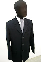
Costumes used in the trailer where typical. For the male role we used a suit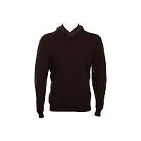 making him look important and as if he has an important job.
The killer we used dark clothes because we didnt want too give to much away. We used a black hooded jumper and dark trousers. We made sure the hood was up because we didnt want to show the face too much which is a key factor when making teaser trailers.
Editing
When editing we used Adobe premire elements. This program we found quite difficult to pick up due to none of us using it previously. This made it much harder to use it. Also the computers we used were very slow again making it harder to meet deadlines. However this software is much easier to use than our previous program which was called ULEAD. Adobe is much more complex which has lots more features available such as transitions.
Once we got the hang of things we found it a bit easier to use. Things such as lightening and darkening the shots where really handy for us as then we could film at any time of the day and just edit it later to how we wanted.
Transistions where also much better than the other program (ULEAD) and this made our film look more proffesional and better than the other film we had made last year.
Location
Typical horror locations are:
Sound
Sound that we used in our trailer are background music found on the internet - free uncopy writted downloads.
We also used sound effects again found from the internet. I found the sound effects because i felt it was important to have a ambiant sound over the shot because it will make it more significant for the shot. Sound effects that we used were
Props used in our trailer are knifes, fake blood, sold sign, swing, weather clock, costumes, caution tape, candles and a laptop. Some of these are key horror conventions which indicates what genre we are doing.
We wanted to use props so to make it feel more realistic.
Titles
Titles we used where the following....

Costumes used in the trailer where typical. For the male role we used a suit
 making him look important and as if he has an important job.
 The killer we used dark clothes because we didnt want too give to much away. We used a black hooded jumper and dark trousers. We made sure the hood was up because we didnt want to show the face too much which is a key factor when making teaser trailers.
Editing
When editing we used Adobe premire elements. This program we found quite difficult to pick up due to none of us using it previously. This made it much harder to use it. Also the computers we used were very slow again making it harder to meet deadlines. However this software is much easier to use than our previous program which was called ULEAD. Adobe is much more complex which has lots more features available such as transitions.
Once we got the hang of things we found it a bit easier to use. Things such as lightening and darkening the shots where really handy for us as then we could film at any time of the day and just edit it later to how we wanted.
Transistions where also much better than the other program (ULEAD) and this made our film look more proffesional and better than the other film we had made last year.
Location
Typical horror locations are:
- woods
- diserted area
- house
- circus
- grave yards
- hospitals
- boat/ocean
We used two of the above. The location is very important because you want the audience to be able to relate to the location but you also want them to feel that there is something completly diffrent to the film making it exciting and new.
Lighting used in out trailer is very little. This is because we want it to be dark making it scary and eere. We used spot lights for outside e.g. the swing shot. We used candles for a flickering effect and we used house lights and lamps for inside.
Sound
Sound that we used in our trailer are background music found on the internet - free uncopy writted downloads.
We also used sound effects again found from the internet. I found the sound effects because i felt it was important to have a ambiant sound over the shot because it will make it more significant for the shot. Sound effects that we used were
- creaking of the swing
- slamming of doors
- sharpening of knifes
- Tap running
This are just a few of what we had used.
Props
Props used in our trailer are knifes, fake blood, sold sign, swing, weather clock, costumes, caution tape, candles and a laptop. Some of these are key horror conventions which indicates what genre we are doing.
We wanted to use props so to make it feel more realistic.
Titles
Titles we used where the following....
- 'A new home...'
- 'A new job..'
- 'A new start?'
- 'Every neighbour hood has a story'
- 'This is theres'
- 'How well do you know your neighbours'
Breakdown Of Our Trailer - Evaluation
This is a description explaining everything in our trailer. This should help explain what we were aiming for in every shot.
 This next shot fades in from the previous sold sign and a medium shot of the man shows two things. One that he is the main character in the film. Also from the clothes he is wearing it is obvious to the audience that he is the protagonist in the trailer. By using costume to tell the audience this it saves time and helps the audience get an idea about the character.
 A title is in between this shot, which talks about a job, hence why the character is wearing a suit. This will again helps the narritavie and makes the audience feel comfatable at this moment in time. The audience are almost meant to relate to coming home from a stressfull day at work.
 After another title the scene changes to extreme close up of a person holding and twisting a knife. This is significant as it is the first horror convention of a knife being used. By putting this horror indicator in from the start it will attract the audience.
 As this part of the trailer is the montage the editing is very fast as this point. It fades into a shot from the outside, varying the location. The Mise En Scene in this shot is that the characters costume is bad and that he is not a good character.
 A medium shot of a swing in the dark, seemlessly swinging on its own is a creepy shot used over and over again in horror films. Therefore this is a horror indicator and the audience will be able to tell this from the ambient sound as well.
 With the swing shot fading into this one, the audience will be able to tell what kind of film this is by now. By showing 'blood' it will entice the male audience who enjoy blood and guts. Again, this a typical horror convention.
 Another title appears and this shot cuts in. The significance of this shot is that when a person sees yellow tape, they will assume that something sinister has occured. This is the effect that we were hoping for the audience to take.
 A panning shot of the tape from futher back is then used highlighting the importance of the tape and the house behind it. The use of the enigma code will help keep the audience attracted and make them think why is that house taped off?
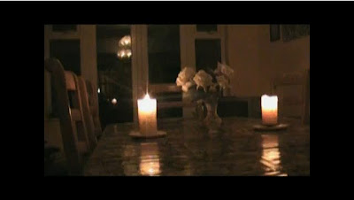 The scene cuts back to the main location and a shot of a light dining room cuts to a darkerned one which shows that this house and the people inside may be about to see the dark side of life. Using the candle as light is often seen in horror films and this is another reason why we included it.
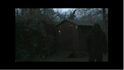
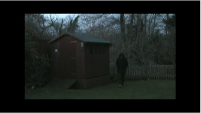 Cutting back outside now, the audience will be rembering seeing this character before. They will wonder why he is there again and why he is in this couples garden.
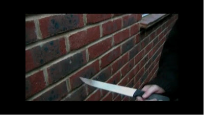
With a fade in transtion, a knife is scraped along a wall. Not only does it sound horrible, it is a creepy thing to see. This is another typical horror convention and helps build more tension within the viewers.
 To keep the narrative of the trailer going, we cut straight back into the house with the protagonist banging on a locked door. The camera moves towards the door and seems to go through the wall.
 With the effect of the camera going through the wall, it shows why the character is unable to open the door. Not only is the a terryfying shot, it is a moment that any person home alone would hate to be in.
 It then cuts to the man walking towards the door after someone has rung a bell. It tracks him walking through the doorway and is a good way of showing his movement.
 The man opens the door and is shocked to see no one is there. By using a medium shot it allows the audience to see the room and the character looking outside. Also as he opens the door the music stops allowing for the viewers mind to focus on what is happening on screen. As the couple being terrorized is the main part of the storyline of the film we had to include a prank such as knock down ginger. This is can be seen as the first part of them being terrorized.
 The man decides no one is there and as he puts the lock on the door he utters the words 'bloody teenagers'. This is something most people would blame a knock down ginger prank on and the audience know who it was.
 The last shot is our best one as we filmed it and cut it precisely to give its desired effect. Most trailers we analyzed had a brilliant last shot and we wanted something like this so that people would rememeber the trailer.
The second to last shot is of the title and all the credits. We included this because we felt that it would make it seem very professional. Also it helped tell the viewer when the film will be released. The last shot is a jumpy one as the hooded character moves right behind the man.
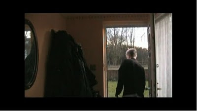
 This is the establishing shot we have used to set the location of the film. This shows to the audience that the trailer is going to take place in a normal suburban house which many people will be able to relate to, making it scarier. We like this shot as it captures the whole house and also includes some sky line.
 This close up of the sold sign begins to tell the story of our trailer. It shows to the audience that the house they have previously seen has been sold.
 This next shot fades in from the previous sold sign and a medium shot of the man shows two things. One that he is the main character in the film. Also from the clothes he is wearing it is obvious to the audience that he is the protagonist in the trailer. By using costume to tell the audience this it saves time and helps the audience get an idea about the character.
 A title is in between this shot, which talks about a job, hence why the character is wearing a suit. This will again helps the narritavie and makes the audience feel comfatable at this moment in time. The audience are almost meant to relate to coming home from a stressfull day at work.
 After another title the scene changes to extreme close up of a person holding and twisting a knife. This is significant as it is the first horror convention of a knife being used. By putting this horror indicator in from the start it will attract the audience.
 As this part of the trailer is the montage the editing is very fast as this point. It fades into a shot from the outside, varying the location. The Mise En Scene in this shot is that the characters costume is bad and that he is not a good character.
 A medium shot of a swing in the dark, seemlessly swinging on its own is a creepy shot used over and over again in horror films. Therefore this is a horror indicator and the audience will be able to tell this from the ambient sound as well.
 With the swing shot fading into this one, the audience will be able to tell what kind of film this is by now. By showing 'blood' it will entice the male audience who enjoy blood and guts. Again, this a typical horror convention.
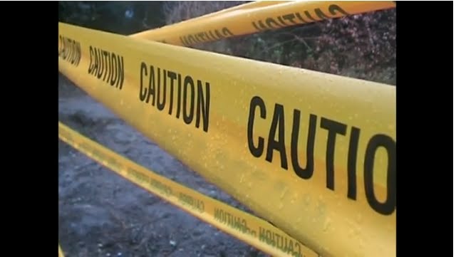 Another title appears and this shot cuts in. The significance of this shot is that when a person sees yellow tape, they will assume that something sinister has occured. This is the effect that we were hoping for the audience to take.
 A panning shot of the tape from futher back is then used highlighting the importance of the tape and the house behind it. The use of the enigma code will help keep the audience attracted and make them think why is that house taped off?
 The scene cuts back to the main location and a shot of a light dining room cuts to a darkerned one which shows that this house and the people inside may be about to see the dark side of life. Using the candle as light is often seen in horror films and this is another reason why we included it.
 Cutting back outside now, the audience will be rembering seeing this character before. They will wonder why he is there again and why he is in this couples garden.
With a fade in transtion, a knife is scraped along a wall. Not only does it sound horrible, it is a creepy thing to see. This is another typical horror convention and helps build more tension within the viewers.
 To keep the narrative of the trailer going, we cut straight back into the house with the protagonist banging on a locked door. The camera moves towards the door and seems to go through the wall.
 With the effect of the camera going through the wall, it shows why the character is unable to open the door. Not only is the a terryfying shot, it is a moment that any person home alone would hate to be in.
 It then cuts to the man walking towards the door after someone has rung a bell. It tracks him walking through the doorway and is a good way of showing his movement.
 The man opens the door and is shocked to see no one is there. By using a medium shot it allows the audience to see the room and the character looking outside. Also as he opens the door the music stops allowing for the viewers mind to focus on what is happening on screen. As the couple being terrorized is the main part of the storyline of the film we had to include a prank such as knock down ginger. This is can be seen as the first part of them being terrorized.
 The man decides no one is there and as he puts the lock on the door he utters the words 'bloody teenagers'. This is something most people would blame a knock down ginger prank on and the audience know who it was.
 The last shot is our best one as we filmed it and cut it precisely to give its desired effect. Most trailers we analyzed had a brilliant last shot and we wanted something like this so that people would rememeber the trailer.
The second to last shot is of the title and all the credits. We included this because we felt that it would make it seem very professional. Also it helped tell the viewer when the film will be released. The last shot is a jumpy one as the hooded character moves right behind the man.
Evaluation Of Sound - Evaluation
Sound in a horror trailer is very important as it will help give meaning and build tension. As we were not able to use copyrighted material we had a hard time finding decent sounds. After a long time searching for sounds we finally found some on a software package.
Pros
Pros
- The music which we used helped build the tension in the scene. This was similar to what we saw in trailers which we analyzed in our planning and preparation stage. By putting the fast paced soundtrack with the montage shots, it helped create a tense atmosphere, like teaser trailers are supposed to do.
- We used a range of sounds including sound effects motifs which helped show to the audience who the villain was in the film. Straight away it tells the audience that the character on screen is not good.
- To emphasize the importance of some sounds we turned up the volume on some scripts. We were able to this from using the editing software, Adobe Premiere Elements, allowing shots like when the man locks the door, to be louder than usual. This was key because again it helped us tell the narrative of the trailer quickly and effectively.
Cons
- As the sound equipment we used weren't amazing, we had to make sure if we were filming outside that background such as the wind and roads did not ruin the clips. This cut down the amount of time we had to film due to a lot of poor weather.
- Lack of un-copyrighted music restricted our choice dramatically. With limited resources we found reasonably good music but if we could have used other, copyrighted, music we would have.
- At times the sound bridges between shots didn't flow perfectly and they could of been made to fade in and out.
What would we do differently?
If we were aloud to use copyrighted music we would use that, if not we would take more time in making actual sounds ourselves. Also we would use more more synchronous sounds to help tell the audience how we want them to feel. Finally we would make sure we used better microphones to capture high quality sounds to enhance the audiences experience.
Evauluation of Screen Shots.
 Shot 1
This shot is an establishing shot. This is the beginning shot of the teaser trailer. Establishing shots set the scene and location of the place. Ours shows a house which is a typical setting. This is because people can relate to as it is a normal looking suburban house.
 Shot 2
This is a shot of one of our title sequence. The thing that's most significant in this is that it has a red question mark. We used this to create a mood of the colour. In this case it relates to death and blood. We use it against a black screen to give maximum impact and the font papyrus we used to create a horror aspect.
 Shot 3
This shot is a close up of the knife, this is used to make the audience scared. The lighting is quite dark and it makes the audience just recognise that its a knife. Having the lighting dark lets us not give much away but also by it being scarier at night which is a key horror generic convention.
 Shot 4
This is a shot in the woods of a guy walking up through there garden. We used a special effect called 'Ghost'. This makes the person transparent when moving but also blurry. This worked well with what we were trying to portray (horror generic conventions). Again having it in the dark makes it more scary.
 Shot 5
This shot is a image of a weather clock. In the reflection you can see the shine of a knife. This is a typical shot that you can find in most horror films. The reflection shot is used to give a brief view of whats going to happen.
 Shot 6
This shot is of a sink with blood in it. We has shown this for effect of the horror conventions (blood, death, killer etc.) Having the blood all over the sink makes it feel like that someone is dead. Having the hands there also you are unsure if they killed the person or they are hurt.
 Shot 7
This shot is a close up of a caution tape used by police when there is a death. This is used to make viewers know that there will be death which can intise viewers to come and watch it. Yellow tape also represents explosives which could relate to the film.
 Shot 8
This shot is a mid shot of a swing. There is only a spot light shown on the swing and in the trailer the swing is swaying making you feel like something is there. The spotlight is used to make you focus on that key point.
 Shot 9
This shot is off a hand clipping on the chain on the door. This is a close up to show the significance of this shot. This is shown as important because it may come up later in the film. It also may be because someone could get in the house another way.
 Shot 10
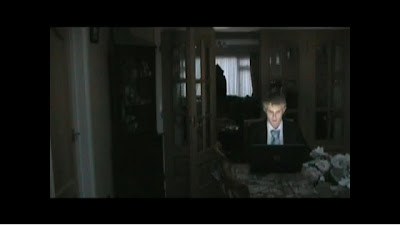
Shot 10 is a typical horror shot of someone with there back to a killer. The hooded character is shown in the foreground because you don't want them to make out who this person is. The person on the laptop has the light reflected on there face to show there reaction. Having this makes the audience realise that he doesn't know that there is anything behind him.
Monday, 29 March 2010
Empire magazine cover analysis : Research and Planning

- Starting with the main selling point of the magazine which is of the 3 main characters in the frame. This is the main selling point because it gives away the genre, the man on the right is dressed in a superhero costume which tells the audience that there will be some action in the film. The man in the centre of the frame is blue and looks like there might be some element of sci-fi in the film.
- The title of the film is indicated very clearly in a yellow font colour. The title is in the second biggest font size on the page after the name of the magazine. The font colour is a yellow colour, the yellow may indicate light, linking this with the title of the film watchmen may tell the audience what the film may be about which may be a lighthouse.
- The magazine offers the first look at the citizen kane of superhero movies, people would want to read about this and find out how the film was constructed and if there will be any future films.
What i have picked up from this poster is how we could use props such as costumes to give away the genre.
Subscribe to:
Comments (Atom)