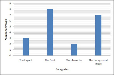
What i found out form the survey was that the font used for the title of the film could have been improved on the most. Looking back at the magazine front cover the title font does look a bit plain maybe changing the colour or the font itself into a more creepy looking font could improve it.
No comments:
Post a Comment