The first one we used was this, the establishing shot:
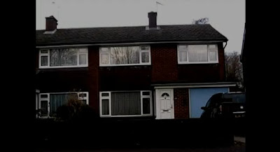
We used this to establish the setting of the trailer and introduce the audience to the genre and setting. the darkness of the shot signifies it will be a dark film and they use of a normal house allows the audience to relate to it.
Shot 2 fades in from shot 1 and is a shot of a sold sign:
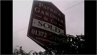
We used this to tell the audience that the couple were moving into a new house and to help with the narrative as well as tie in with the next shot.
This next shot is of the first title sequence we have in our trailer:
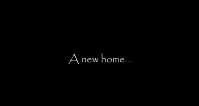
This is used to help the narrative along. The use of the white writing signifies purity and safety, this is in juxtapose to the red dots which signify danger and bloodshed, this is also a genre indicator and a clue to what is going to happen in the trailer.
Shot 3 introduces our main protagonist:
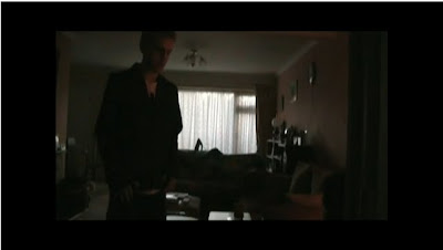
He is wearing a black jumper which signifies his dangerous side coupled with the white shirt he is wearing underneath signifying the good nature of him. He is comforting his wife who did not want to move to the new area but had to because of his job so has some resentment towards him because of that. He is standing over her which signifies his power over her and the scene.
Next we see the man returning home from work:

He is dressed in a light coloured shirt signifying his good nature but looks tired from the days work. This is used to allow the audience to relate to the trailer and feel attached to the characters.
This is followed by another title:
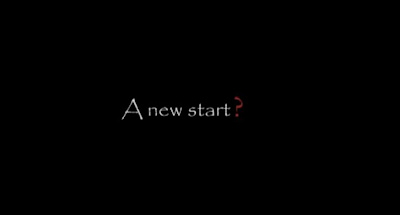
This is when the trailer changes, the blood-red question mark is accompanied by a drum beat which signifies danger. The black background almost resembles an abyss which the characters cannot escape from within the trailer.
After this the trailer moves into a montage staring with this shot:

This is the first shot that shows the villain and also the first shot to show a weapon. The villain is wearing a black hooded jacket signifying his dark side. He is in a kitchen which allows the audience to relate as it looks familiar to them.
The montage section features fast editing techniques and fades in and out of shots, the next shot is of the villain standing menacingly in a garden:

This shot is used to create horror and tension for the audience. The villain's costume is all black which signifies his intentions are bad and his face is hidden creating curiosity in the audience to find out who he is.
The next shot in the montage is a shot of a swing, this is used to create an eerie atmosphere:

This shot is a homage to a similar shot from Friday the 13th where a swing is used to create an eerie atmosphere.
Following this is a point-of-view shot from one of the characters as they look out a cupboard they are hiding in:
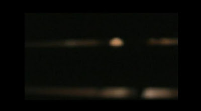
This scene is of the killer stalking the main characters as they hide in a cupboard and builds tension well. The blurry nature of the shot signifies the couple may have already been injured and heightens the already tense atmosphere.
Next we have a reflection shot of a knife glinting in the reflection of a clock as the killer walks past:
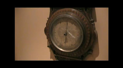
This shot also builds tension because the audience is unaware whether or not it is a point-of-view shot, meaning the character is about to be killed, or that it is a mid-shot and that the characters are somewhere else, safe, for the moment. We tried to use a varied array of shots to allow diversity in our work and this shot is a prime example of this.
Another example of our varied shots is this one, a tracking shot from a moving vehicle as we shoot a cordoned-off house, which leaves an enigma for the audience:
This shot uses tracking to allow a sense of movement in the scene along with bringing another dimension to our film. We used this shot also to show the house in a non-linear fashion allowing the audience to see the house from a different perspective.
The next shot I've chosen is the killer scraping his knife on the wall of the couples house, signifying power:
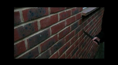
This shot has been edited so that the diagetic sound of the knife scraping on the wall is louder than everything else in the scene to give it power in the scene and make it the main focus of the scene. The significance of the knife is that it is the killers trademark weapon so the audience automatically associates it with him and knows whats coming next, allowing the audience to understand the narrative.
The montage ends with the main character opening the front door of his house:
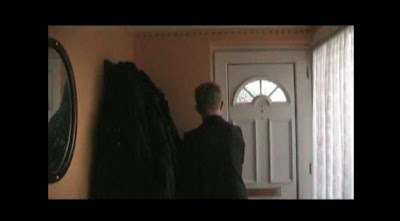
This shot is accompanied by the montage music ending and fading out to signify that the montage has ended and the opening of the door signifies something new is coming.
This is followed by a close-up of the door being locked:
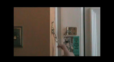
This is another shot we used to show shot variation, the close-up shows the main character locking the door signifying his fear of what could be outside; this also entices the audience to watch on to find out what is outside.
The last sequence of shots features a singular shot that has the killer moving forward in it behind the main character:
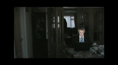
This is another example of shot variation and editing combining to create a unique shot. Each time the killer moves forward a drum beats as well, this could also be linked with a heartbeat as it increases as the killer gets closer, heightening the tension. This sequence was desinged to scare the audience and leave them wanting to find out what happened next in the trailer.
The penultimate shot is the end credits, we used this to make it look more professional:
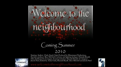
This was used to show the release date, production company and distributor. We thought this would add an authentic feel to the trailer as most trailers we had watched featured this at either the beginning or end.
The last shot, and arguably the most important because it is the shot the audience will remember best, is of the killer standing behind the main character as he is sitting down at his laptop:
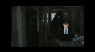
This portrays the power the killer has over the main character as he is standing over him. It also leaves the trailer on a cliffhanger leaving audiences wanting to know more.
I feel our trailer does its job as a teaser trailer well. It leaves enigma and cliffhangers throughout the trailer meaning audiences are left with a sense of excitement to find out what happens to the characters they related to in the trailer. It is authentic and relatable and has a tense narrative throughout the trailer moving it forward to a cliffhanger climax.
No comments:
Post a Comment