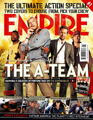
The front cover I am analysing is the A-Team Empire magazine cover, it is a two-part front cover the other being The Expendables cover which I previously analysed. The two covers are almost identical apart from the main cast picture. There are even similarities in the picture, for instance the main character in both pictures is smoking a cigar and the secondary main characters are holding weapons, this both signifies genre and power. The front cover consists of the main cast of The A-Team standing over the camera signifying power, the background is the as that of The Expendables front cover signifying they are of similar caliber. The main font over the cast is again the largest font on the page, barring the magazine title, and it reads "The A-Team" automatically drawing the reader in and informing them of the film's title. The tagline above the main title reads "WE LOVE IT WHEN A PLAN COMES TOGETHER!" this allows the reader to assume they are a team and that they have some sort of explosive plan. The same bullet-ridden bottom part of the magazine is still there to draw the reader in and the bullet holes are another genre indicator. This time however the writing at the bottom is red compared with the other cover which was blue, this could indicate that this film is more dangerous or features more bloodshed and it helps to distinguish the two covers.
No comments:
Post a Comment