skip to main |
skip to sidebar
Magazine Cover - Evaluation
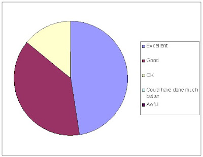
This diagram shows what people thought of our film poster. The majority of the poster shows that they thought it was excellent which is brilliant because we tried really hard in potraying the horror conventions found in a typical horror poster. No-one thought it was awful or could have done much better which is great. Comments made to us were about the colours used and the angle of the image. They liked how the killer was made to look powerful and the red writting was effective.
The diagram shows what people thought of our magazine cover. Most of the people thought it was good and ok. This makes us feel we could have worked better in the poster. For example we could have added a significant colour e.g. red in all the writting which would represent blood. 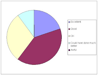
No comments:
Post a Comment