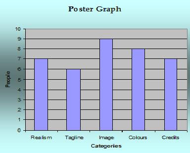
This is their opinion on our poster: The main area the audience thought was good was the image itself, we had several pictures to choose from and decided this was the one because the light was right. The audience also felt that it was realistic and this was rewarding because we wanted to make it as authentic as possible. Colour was also a favourite of the audience, we wanted to go for a horror-style look so made it black & white with red decals to signify violence to indicate genre. The audience felt the tagline and credits were lacking compared to the high standards of the rest of the poster which were the last two aspects of the poster to be made so had to fit around the existing poster therefore were not quite up to standards with the rest of the poster.
here is what they thought of the magazine front cover:
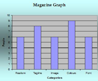
The main positive I received about our magazine front cover was that the colours worked well together. They also felt that the titles were realistic and added authenticity to the cover. Image, fonts and it's realism were also positively commented on. This all amalgamated into an informing and eye-catching magazine cover that attracted readers attention.
No comments:
Post a Comment