Friday 30 April 2010

What we could improve on : Evaluation

I have done a survey out of 20 people to find out other peoples opinion on what we could improve on our trailer.


From the survey i found out that the props was the main thing that other people thought we could improve on. In my opinion i think we used the correct clothing to match the correct characters, making audiences aware of the goody and bady, we used weapons for the villain to indicate to audiences that this person is a villain and finally a normal house background props. The normal background props was probably the thing that let us down as in our film, the couple move to a new home and the house they moved in had lots of furniture already. Clearing a house a 5 would be a bit difficult so moving things out the house to make it more effective would have been impossible. If we had a bigger budget we could have rented a house that had nothing apart from the main things needed when moving to a new house.

lighting evaluation

Lighting Evaluation

When deciding what lighting to use we all made a group decision to make it as spooky as possible. We made this happen by having as much dark lighting as possible. Here are some of the possible shots we could have done or we did use.


This is a shot of a corridor. The light used is a dark/ dimmed lighting. This gives the effect of a dark and Erie room.

The red lighting also gives the effect of death and blood. We did not use this lighting as it is very costly. However by using this, this would create a better atmosphere for our audience by giving it a clear genre.


Spotlights are a good way of representing the horror genre. This is because of it is highlighting something of importance. However by not knowing whats beyond the light is what makes is a scary lighting effect.


The moon. The moon is a natural lighting, but because of it only been showing at night gives the effect of darkness. Some people believe the resemblance of day to night is extraordinary because they think that everything evil happens at night. This is why we used this effect of having the moon.


This shot is of a candle. We used a candle in our film so to create a creepy atmosphere. By using a candle it gives the impression of 'whats beyond the light'. Having this would mean that people are scared landing us in a typical horror film.
Using a typical candle it naturally flickers so this creates an even more creepy atmosphere as it can go completely dark.

Thursday 29 April 2010

Animatics for trailer shots : Research & Planning


This is a short video using a piece of editing software to show the range of shots we used. We may not have used all of these shots but it shows what we thought we could use. This animatic which I created also shows some shots which we did include in the trailer. It shows the ideas of the storyboards into a visual video which is clearer to see. Finally it helped to decide what scenes and locations of the house to include and not to include.

Evaluation of our three tasks

I feel our three tasks compliment each other very well. They work both as a whole and as a stand-alone feature allowing the marketing campaign to look professional. The first of these, the poster, is designed to intrigue the audience into wanting to know more about the character and location in the poster and also features genre indicators that appeal to our target audience. It is in black & white allowing audiences to automatically notice that the film is going to be a dark film, it features red decals signifying danger or violence which is another genre indicator and also lends a clue to the narrative of the film, it also features the production company and distributor which also have a fanbase meaning the poster will appeal to all who like that particular companies previous ventures. The poster ties in well with the magazine front cover because it features the same character so adds notoriety to the film. It also works well with the trailer because it features the same dark shots so allows audiences to relate it with the poster. In the poster we wanted to only hint at the location and characters to allow the audience to learn the main setting and characters but not know the narrative or plot-twists. We chose to only show one character to allow audiences to be surprised when watching the trailer and being introduced to new characters.

Next in our marketing campaign is our magazine front cover, this features the same character from our poster who is now holding a knife. Again the font colour used on the front cover was red to signify the characters villainous tendencies and to attract readers with its eye-catching appearance. It ties in well with the poster because it features the same blood-red text which automatically allows audiences to relate it with the poster and build hype about it, it also features the location from the trailer allowing the audience a glimpse into the setting of the film allowing them to understand the narrative and characters better. We used the same character as the poster to not reveal too much about our film and also to add notoriety to this character, we did not want to give away anymore than this to allow the trailer to have added impact when seen by the audience.

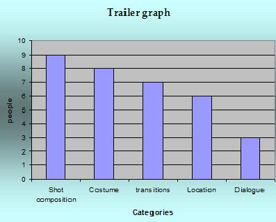
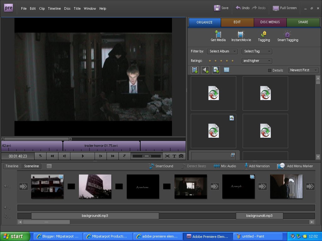
last in our marketing campaign is our trailer. This was the main tool used to market the film and is the most revealing about the film. It features a montage of shots from the film allowing audiences a sneak-peek into the films location and characters and wets their appetite for the film. It features elements from the poster and magazine front cover allowing audiences to automatically relate to the characters and build on what they had learnt from the two previous marketing tools. We chose to show only one setting in our trailer to not give away anymore locations in the film that might hint at the narrative, we also chose to show more than one character that had previously been seen in the poster and magazine to introduce the heros in a different light than that of the villain in the poster and magazine; therefore showing them in a different light to the villain.

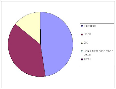
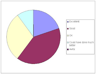
Overall I feel the marketing campaign was a success. It allowed the audience an insight into the film as well as teasing the audience into wanting to know more about the film and its characters.

Wednesday 28 April 2010

Audience feedback of poster & magazine cover

I asked 20 people their opinions on our poster and magazine cover and what we could improve on:
This is their opinion on our poster: The main area the audience thought was good was the image itself, we had several pictures to choose from and decided this was the one because the light was right. The audience also felt that it was realistic and this was rewarding because we wanted to make it as authentic as possible. Colour was also a favourite of the audience, we wanted to go for a horror-style look so made it black & white with red decals to signify violence to indicate genre. The audience felt the tagline and credits were lacking compared to the high standards of the rest of the poster which were the last two aspects of the poster to be made so had to fit around the existing poster therefore were not quite up to standards with the rest of the poster.

here is what they thought of the magazine front cover:


The main positive I received about our magazine front cover was that the colours worked well together. They also felt that the titles were realistic and added authenticity to the cover. Image, fonts and it's realism were also positively commented on. This all amalgamated into an informing and eye-catching magazine cover that attracted readers attention.

Audience response - Evaluation

We showed our trailer to a group of our peers for them to assess and evaluate (From 0.00 - 3.52):


Our audience said our trailer: built tension well however it was too slow, they also commented on our use of pure white font in juxtapose to blood red font insinuating voilence, and said that the use of location worked well to make the main character feel isolated and lonely making it relatable.

Analysis of shots from our trailer

I am going to evaluate all the shots from our trailer to analyse the techniques we used, why we used them and why they were effective.

The first one we used was this, the establishing shot:


We used this to establish the setting of the trailer and introduce the audience to the genre and setting. the darkness of the shot signifies it will be a dark film and they use of a normal house allows the audience to relate to it.

Shot 2 fades in from shot 1 and is a shot of a sold sign:


We used this to tell the audience that the couple were moving into a new house and to help with the narrative as well as tie in with the next shot.

This next shot is of the first title sequence we have in our trailer:


This is used to help the narrative along. The use of the white writing signifies purity and safety, this is in juxtapose to the red dots which signify danger and bloodshed, this is also a genre indicator and a clue to what is going to happen in the trailer.

Shot 3 introduces our main protagonist:


He is wearing a black jumper which signifies his dangerous side coupled with the white shirt he is wearing underneath signifying the good nature of him. He is comforting his wife who did not want to move to the new area but had to because of his job so has some resentment towards him because of that. He is standing over her which signifies his power over her and the scene.

Next we see the man returning home from work:


He is dressed in a light coloured shirt signifying his good nature but looks tired from the days work. This is used to allow the audience to relate to the trailer and feel attached to the characters.

This is followed by another title:


This is when the trailer changes, the blood-red question mark is accompanied by a drum beat which signifies danger. The black background almost resembles an abyss which the characters cannot escape from within the trailer.

After this the trailer moves into a montage staring with this shot:


This is the first shot that shows the villain and also the first shot to show a weapon. The villain is wearing a black hooded jacket signifying his dark side. He is in a kitchen which allows the audience to relate as it looks familiar to them.

The montage section features fast editing techniques and fades in and out of shots, the next shot is of the villain standing menacingly in a garden:


This shot is used to create horror and tension for the audience. The villain's costume is all black which signifies his intentions are bad and his face is hidden creating curiosity in the audience to find out who he is.

The next shot in the montage is a shot of a swing, this is used to create an eerie atmosphere:


This shot is a homage to a similar shot from Friday the 13th where a swing is used to create an eerie atmosphere.

Following this is a point-of-view shot from one of the characters as they look out a cupboard they are hiding in:


This scene is of the killer stalking the main characters as they hide in a cupboard and builds tension well. The blurry nature of the shot signifies the couple may have already been injured and heightens the already tense atmosphere.

Next we have a reflection shot of a knife glinting in the reflection of a clock as the killer walks past:


This shot also builds tension because the audience is unaware whether or not it is a point-of-view shot, meaning the character is about to be killed, or that it is a mid-shot and that the characters are somewhere else, safe, for the moment. We tried to use a varied array of shots to allow diversity in our work and this shot is a prime example of this.

Another example of our varied shots is this one, a tracking shot from a moving vehicle as we shoot a cordoned-off house, which leaves an enigma for the audience:


This shot uses tracking to allow a sense of movement in the scene along with bringing another dimension to our film. We used this shot also to show the house in a non-linear fashion allowing the audience to see the house from a different perspective.

The next shot I've chosen is the killer scraping his knife on the wall of the couples house, signifying power:


This shot has been edited so that the diagetic sound of the knife scraping on the wall is louder than everything else in the scene to give it power in the scene and make it the main focus of the scene. The significance of the knife is that it is the killers trademark weapon so the audience automatically associates it with him and knows whats coming next, allowing the audience to understand the narrative.

The montage ends with the main character opening the front door of his house:


This shot is accompanied by the montage music ending and fading out to signify that the montage has ended and the opening of the door signifies something new is coming.

This is followed by a close-up of the door being locked:


This is another shot we used to show shot variation, the close-up shows the main character locking the door signifying his fear of what could be outside; this also entices the audience to watch on to find out what is outside.

The last sequence of shots features a singular shot that has the killer moving forward in it behind the main character:


This is another example of shot variation and editing combining to create a unique shot. Each time the killer moves forward a drum beats as well, this could also be linked with a heartbeat as it increases as the killer gets closer, heightening the tension. This sequence was desinged to scare the audience and leave them wanting to find out what happened next in the trailer.

The penultimate shot is the end credits, we used this to make it look more professional:


This was used to show the release date, production company and distributor. We thought this would add an authentic feel to the trailer as most trailers we had watched featured this at either the beginning or end.

The last shot, and arguably the most important because it is the shot the audience will remember best, is of the killer standing behind the main character as he is sitting down at his laptop:


This portrays the power the killer has over the main character as he is standing over him. It also leaves the trailer on a cliffhanger leaving audiences wanting to know more.

I feel our trailer does its job as a teaser trailer well. It leaves enigma and cliffhangers throughout the trailer meaning audiences are left with a sense of excitement to find out what happens to the characters they related to in the trailer. It is authentic and relatable and has a tense narrative throughout the trailer moving it forward to a cliffhanger climax.

Tuesday 27 April 2010

Title conception

We put a lot of thought into coming up with an original title for our film that also linked in with the film itself. Through our research we saw that most horror films had short titles e.g. Scream, Saw and Alien, so we wanted to do something different and use a longer title to give the audience an insight into the film as well as it being catchy. After a shortlist was drawn up we decided to go with "Welcome to the neighbourhood" this was short enough to catch the readers attention and be memorable but at the same time give the audience an insight into the films possible narrative and setting.

The A-Team Magazine cover analysis - Evaluation


The front cover I am analysing is the A-Team Empire magazine cover, it is a two-part front cover the other being The Expendables cover which I previously analysed. The two covers are almost identical apart from the main cast picture. There are even similarities in the picture, for instance the main character in both pictures is smoking a cigar and the secondary main characters are holding weapons, this both signifies genre and power. The front cover consists of the main cast of The A-Team standing over the camera signifying power, the background is the as that of The Expendables front cover signifying they are of similar caliber. The main font over the cast is again the largest font on the page, barring the magazine title, and it reads "The A-Team" automatically drawing the reader in and informing them of the film's title. The tagline above the main title reads "WE LOVE IT WHEN A PLAN COMES TOGETHER!" this allows the reader to assume they are a team and that they have some sort of explosive plan. The same bullet-ridden bottom part of the magazine is still there to draw the reader in and the bullet holes are another genre indicator. This time however the writing at the bottom is red compared with the other cover which was blue, this could indicate that this film is more dangerous or features more bloodshed and it helps to distinguish the two covers.

The Expendables magazine cover analysis


The front cover I am analysising is the Empire magazine cover for The Expendables featuring Sylvester Stallone, Jason Statham and Jet Li. The front cover features all three of these actors looking menacing, with Stallone smoking a cigar and Li holding a gun. This symbolisation is the genre indicator for the film and also establishes the main characters for the film. The title of the film "The Expendables" is the largest font on the cover (excluding the magazine title) and is white which allows it to stand out from the background. The is a juxtaposition because they are holding weapons yet the white of the writing symbolises safety and calmness meaning they may be the hero's in the film. Behind the main picture of the actors is an explosion, this is another genre indicator and subliminally shows it is going to be an explosive film. The font at the top of the cover reads - "THE ULTIMATE ACTION SPECIAL", this automatically lets the reader know what kind of issue of the magazine it is going to be and also what genre the film is going to be. The tagline above the title of the film reads "We're gunna smoke the A-Team!" this is in reference to another film in that genre and also ties into the picture as Stallone is smoking a cigar. The background picture also gives a clue of where it is going to be set as you can see jungle in the background below the fire. At the bottom there is smaller pictures depicting what else will be in this months issue of the magazine, it features four pictures all at an angle to draw the readers attention and also to suggest that they are not all linear storylines. At the very bottom there is a caption that reads "WORLD EXCLUSIVE! CAPTAIN AMERICA THE PLANET'S FIRST INTERVIEW!, this excites the readers because it allows them a world exclusive that only this magazine features and allows them to be one of the first to read about it. The bottom segment of the page has different font and colouring to distinguish it from the main feature of the magazine, this helps to not draw too much attention away from the main headline but because it is different attracts the readers eye to find out more.

Saturday 24 April 2010

What we could improve on : Evaluation

I have done a survey out of 20 people to find out other peoples opinion on what we could improve on our poster.


From the survey i found out that the background image of the poster could have been improved the most. I thought that by having the house which the couple have moved in would be very effective as it makes the audience aware of the main location of the film. How we could improve it would be by having a small shot of the couple in the film, making the audience aware of all the characters involved in the film.

What we could improve on : Evaluation

I have done a survey out of 20 people to know other peoples opinion on what we could have improved on for our magazine front cover


What i found out form the survey was that the font used for the title of the film could have been improved on the most. Looking back at the magazine front cover the title font does look a bit plain maybe changing the colour or the font itself into a more creepy looking font could improve it.

Evaluation

After completing our trailer we showed it to our peers to allow them to evaluate our work, this is what they thought:


As you can see the majority of the audiences favourite part of our trailer was the shots we used. We put a lot of thought into shot composition so we feel vindicated after this result.

This was followed by costume which was rated second as their favourite part of our trailer. We wanted to create an authentic feel to our trailer and costumes played a major part in this; we used items of clothing that the audience could relate to and this helped add a sense of realism to our trailer.

Next was Transitions which we wanted to make as natural as possible to allow the trailer to flow and have continuity. I feel the transitions are one of the major parts that makes the trailer work so effectively; especially in the montage section because it allows the trailer to flow and pick up speed which is key to this kind of trailers success.

Location was next, this was key to the trailers success because it was the main setting for the trailer. We wanted it look as authentic as possible so the audience could relate to it; therefore not feeling alienated and detached from the trailer.

Last was dialogue; this was mainly because there was only one line of dialogue in our trailer. This is what the majority of the audience thought we could improve on and adding dialogue would make it more immersive. We chose not to use much dialogue to allow the action to speak in our trailer and so it would entice the audience to go and see it to see the acting.

To improve our trailer the audience felt that dialogue could have been added to allow the audience to be more immersed in the trailer. The also felt we could have used more than one location to show different settings for the film to allow the audience to relate to these places and make it feel more authentic.

Overall i feel our trailer worked well as a teaser trailer to entice the audience into wanting to know more; it features a wide range of shots, tense non-diagetic music and a fast-pace to keep the trailer moving. I would have included more dialouge to allow the audience to hear and see the characters more to relate to the them, included another location to add diversification and made the editing smoother and faster to improve the feel of the trailer, but overall I am pleased with the results.

Friday 23 April 2010

What I would've done differently

To improve our trailer I would have done some things differently, for instance:

I would have used more than one location in our trailer to make the production more believable. I think it would have also benefited from better lighting in some of the areas of the location to allow for better visibility in the scenes.

Adjusting to the new software took some time to get used to therefore some pieces of our trailer are not up to the standard they could've been, but overall I feel our trailer was well edited.

The pace of the trailer could have been improved to allow the trailer to flow better. The montage we used added some pace to it but overall it felt a bit slow. The music we used created pace to help the trailer flow but the editing techniques used slowed the trailer down and made the overall feel of the trailer slow.

For our preliminary tasks I would have made the poster look more professional and made it neater, the poster could have used a better picture or included more of the cast to allow the audience to relate to it more and the trailer itself could have included a production company/distributor/director to make it more authentic.

What People Liked Most - Evaluation


This diagram shows what people liked most out of the following catogories. They are the poster, magazine cover, trailer and the blog. This diagram shows that the trailer had won by four points.
The magazine was shown the least intrested in, within the 40 people that we interviewed.

Thursday 22 April 2010

Evaluation continued - Evaluation

After completing our trailer we asked 20 people a number of questions to see what they thought of it. This would help us see what people liked about the trailer and things we could of done differently.

This graph shows that the part which we could of improved on the most is the editing side. The reason the editing might not have been as good as it could of been may have been because we had to get used to using a new software package, which took a lot of time. Also we could of varied more shots throughout the trailer instead of using similar ones in places. Overall most people seemed to really enjoy the trailer and we are happy with the final product.

To find out what people thought about our magazine front cover we asked them their feelings. The graph below illustrates what they felt about the poster. This graph proves that the magazine cover we made proved very popular. The colours used within the cover were most liked and thats something we felt was done well.
The graph below is another graph showing each section of the poster's, score out of 10. The most popular part of the poster was the image which scored top marks and the realism of the poster was rated quite highly.

Magazine Cover - Evaluation

This diagram shows what people thought of our film poster. The majority of the poster shows that they thought it was excellent which is brilliant because we tried really hard in potraying the horror conventions found in a typical horror poster. No-one thought it was awful or could have done much better which is great. Comments made to us were about the colours used and the angle of the image. They liked how the killer was made to look powerful and the red writting was effective.


The diagram shows what people thought of our magazine cover. Most of the people thought it was good and ok. This makes us feel we could have worked better in the poster. For example we could have added a significant colour e.g. red in all the writting which would represent blood.

Audience Feedback

After previewing our trailer to our audience they gave feedback both positive and negative:

Audience member 1: Overall I liked the trailer especially the montage, although I feel the pace could have been faster to create greater tension and fear. To improve the trailer I would've added faster editing techniques to make it flow better.

Audience member 2: I liked the editing techniques used; they created a feel of speed and also how tension was created.

Audience member 3: I really liked the trailer as I could to the realistic setting of the house and the characters. To improve it I would've used more transitions to create a greater feeling of speed.

All of our audience members liked our trailer and had both positive and negative feedback which were all constructive. The main critisism they had was that the trailer needed a great sense of speed; they did take into account that the computer we played it on played the trailer at half speed, but non the less they thought it would've benifited from faster transitions and shots.

What People Liked About Our Film - Evaluation


I asked twenty people what they enjoyed most about our film. They were allowed to tick as many boxes as they liked. These are what the results that they had came up with.
This Chart shows that People enjoyed most about shots & the costumes. I agree with this because i felt it fit in quite well with the story line.
However the dialogue shows that it wasnt as good. This was maybe because of how little amount there was and it was represented quite quietly.
If i was able to re-do our film then I would put more dialogue into the trailer and add more people talking. Prehaps wispering from the killer and some screaming from a female character showing the vunrability.

Tuesday 20 April 2010

Audience feedback Evaluation

In our video feedback clip it shows that people thought our film didn't have very good pace. This was because when we showed it to the class it jumped continuously throughout the whole trailer as the computer we used was terrible and it wasn't in the right software. I feel that our pace was very good and it flowed brilliantly.

Other things they said where that they liked the use of colour in the title sequence. This is referring to the red colour in the question marks and ellipsis.

They liked the fact that we created tension. We did this with the music of the trailer and fading transitions. They also liked the fact that they could relate to the characters so it made it more scary which again created tension.

Realtionships and what i would have done better. - Evaluation

The magazine front cover represents about the film and what you will see in it. You are able to see a much clearer image and this is because the film will have already have been released when viewing the cover of the magazine. The cover shows more in depth information compared to the poster.

The poster shows not as much information (killer front on). This is because we want the audience to come and watch the film to see the killer. It doesn't give much away - only the title. Again this is because we don't want to give much away.

Things that i would have done differently are:
  • Included more bar & pie charts in the research and planning
  • Ti dyed up the poster a bit more -perhaps using better colours and fonts
  • Research more than just horror films so i can compare the difference

Effectiveness Of Main Product And Ancillary Task - Evaluation

With the trailer, poster and magazine front cover all completed the whole campaign is now complete. Each one compliments each other, revealing different parts of the film. The trailer, designed on Adobe Premiere Elements. This is the main source of information and reveals things to with the film such as the location, costumes and the genre of the film. This is through the sound and the shots we used and it creates the start of our marketing campaign. The next stage of it was the magazine cover made on Microsoft Publisher.

The cover we created gave the audience another dimension of information to do with the film. Things such as behind the scenes pictures and exclusive information to with the film entices the reader into finding out more to with the film. This links in with the trailer as they could read the magazine front cover and see that there is a new summer blockbuster film. Then to find out more and see what it looks like, they may search the film on google and find the trailer for the upcoming film. By doing this it will attract more audience attention and hype the film up more. Finally to complete the campaign we made the main film poster for Welcome To The Neighbourhood.

To gain a better understanding of film posters we analyzed several poster including horror ones. After investigating others we came to the conclusion that are poster needed to immediately tell the audience that it is horror. To do this we took a picture of one of us holding an axe, straight away being a genre indicator. Then on Photoshop I darkened it and added some effects. With that done our marketing campaign was finished. They all complimented each other in many ways. The use of similar font and colouring helps keep continuity and makes it all seem very professional. Also the costume worn by the killer in each of the tasks is the same giving the killer an identity.

Use of media technologies

Below is an array of technology we used to create our coursework:

To edit our coursework we used Abode Premiere Elements:


To edit our poster we used Abode Photoshop CS4:


To create our magazine front cover we used Microsoft Publisher:


To create our blog we used Blogspot.com


To film our trailer we used a Canon video camera:


We also used a tripod to ensure steady shots:


For sounds we used an additional microhpone to capture the dialogue of our trailer:

Programs and objects we used - Evaluation


We used the internet for most of the reasearch and planning. We used it to gain infomation on teaser trailers and other aspects to our film such as horror film websites and front covers. We used websites such as youtube to look at websites and google as the search engine to look up horror movie feautres of generic conventions.


Blogger is a website which we use to post comments on all our work. This is the website which I am on now. This was a good posting website as it is easy to use and upload documents. We can easily upload documents/videos and pictures.


This is the program that we used to edit our film teaser trailer together. This has many feautures that we used such as tranisition, lighting and sound effects. This helped peice our trailer together.


Photoshop was the program we used to make our film poster and magazine cover. This also had many effects such as cloning, colour changes, boarders and fonts. This was a good program once we got the hang of using it


Canon Camera's are the schools camera's and are the one's that we used to make our film. This is a image of the camera that we used. It was a small compact camera and was easy to use.


This is a tripod. This is what we used to keep the camera steady in shots. It also gives a smooth effect when moving the camera up and down and side to side. This gave some of the shots a much better shot than if we where to use hand held.


This is our microphone that we plugged into our camera. This gives a better sound and effect to our trailer by having a much clearer sound. It is also useful as we are able to use the sounds recorded and then highlight them to make them 'ambiant' sounds.