How we linked them together:
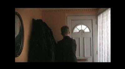
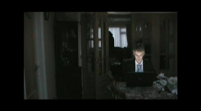
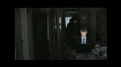
- The main thing the audience want to know about a horror film is who the killer is and why he/she is doing it, this is what makes a horror film. The poster, magazine front cover and trailer all show the villain of the film to the audience but the face is left a mystery. Black clothing is used in all three tasks to indicate the villain, which indicates darkness, which symbolises evil.
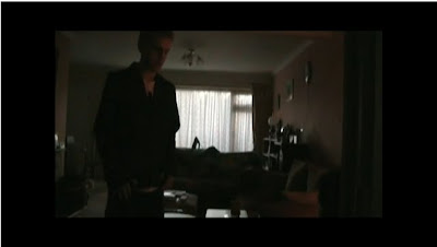
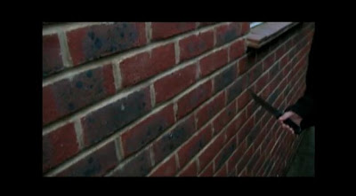
- The magazine front cover and the trailer show the villain holding a kitchen knife as his primary weapon, this is because most of the shots of the villain in the trailer are inside the house and so is the shot of the magazine front cover, both using an indoor weapon. The shot of the villain in the poster is of the villain holding an axe, this is an outdoor weapon. This tells the audience that the villain is very dangerous and will use what ever weapon he/she can get hold of.
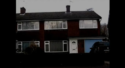
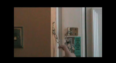
- The magazine front cover, trailer and poster all indicate to the audience the main location of the film. The magazine front cover is of the villain in the house, the poster is of the villain standing in the garden looking at the house in the background and the trailers only location is the house. This tells the audience that the main location is going to be a house.
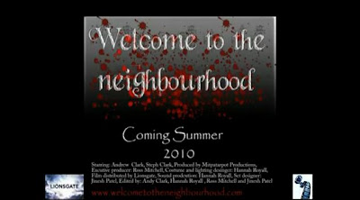
Something we could improve on was using the same font for the title in each of the tasks. We used different fonts for each task which makes the overall campaign look slightly unprofessional. Having the same title font for all three tasks would make it look professional as well as putting a stronger image in the audiences head. All three tasks would be advertised in different places and having the same title font would make audiences remember after seeing a trailer, that this is a poster of that film.


